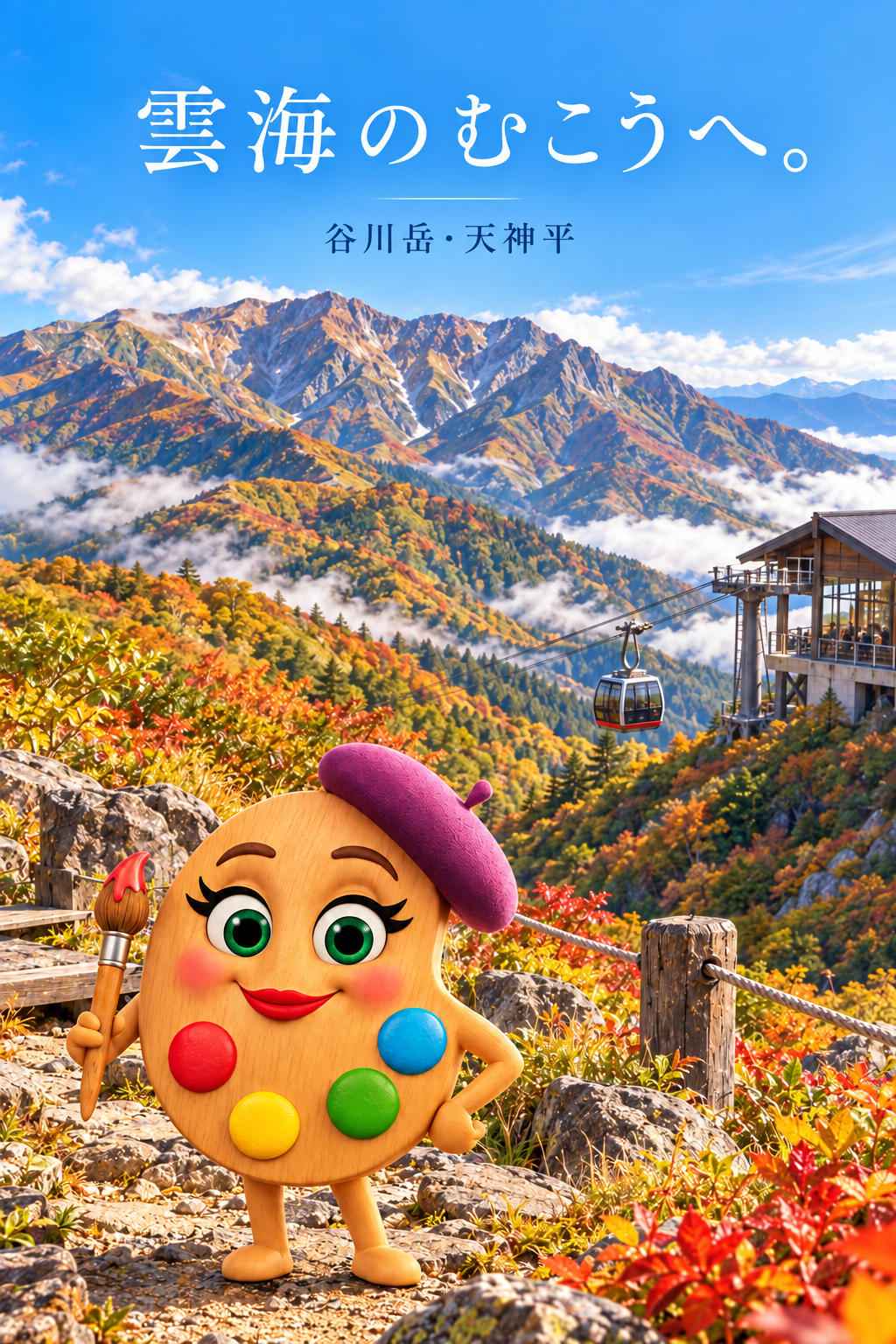
Beyond the Sea of Autumn Clouds
Critique
Introduction This vertical poster invites viewers toward a sea of clouds above the mountains. Description Large white Japanese lettering across the blue sky reads “雲海のむこうへ。” with smaller dark text “谷川岳・天神平” beneath it. Rugged mountain ridges fill the middle distance, their slopes colored with gold, orange, green, and patches of cloud. At right, a gondola hangs on cables beside a station. In the rocky foreground stands a smiling wooden palette character wearing a purple beret, holding a paintbrush, and displaying four bright color spots on its body. Analysis The title occupies open sky and remains readable against uninterrupted blue. A thin line separates it from the place name, establishing a clear typographic hierarchy. The mascot's large eyes and saturated color spots make it the foreground focal point. Warm foliage below balances the cool sky above, and the clouds establish depth between the ridges. Interpretation and Evaluation The poster presents the mountain journey as both an excursion and a creative encounter. The gondola gives a concrete means of reaching the elevated view, while the palette character welcomes a broad audience. The mascot's polished, animated style differs from the more naturalistic mountain backdrop; this contrast is energetic but slightly separates it from the terrain. The large title and clear place label keep the invitation understandable despite the busy lower half. Conclusion The design succeeds through readable typography, strong autumn color, and a memorable guide character. Its clearest promise is a journey from a rocky foreground toward the cloud-wrapped peaks.
Same Subcategory
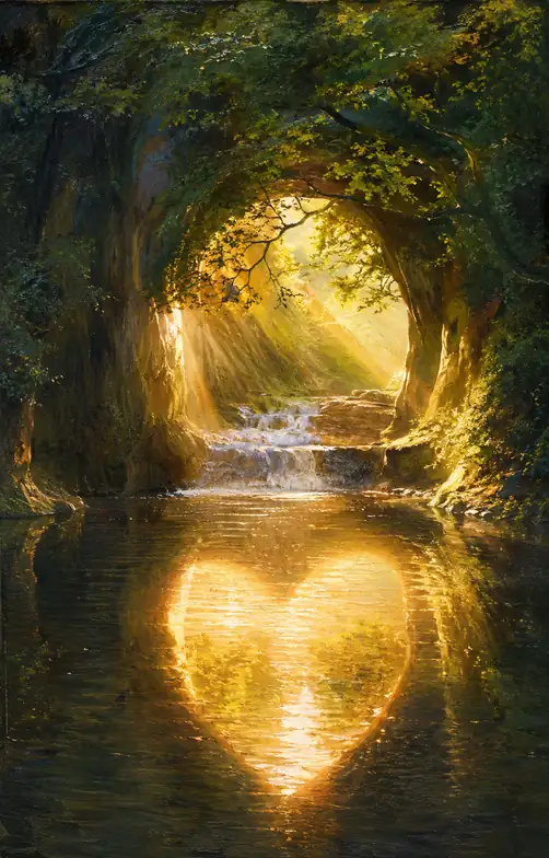 The Heart of Light the Forest Reveals
Similar Artworks
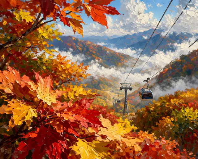 Soaring Above the Autumn Tapestry
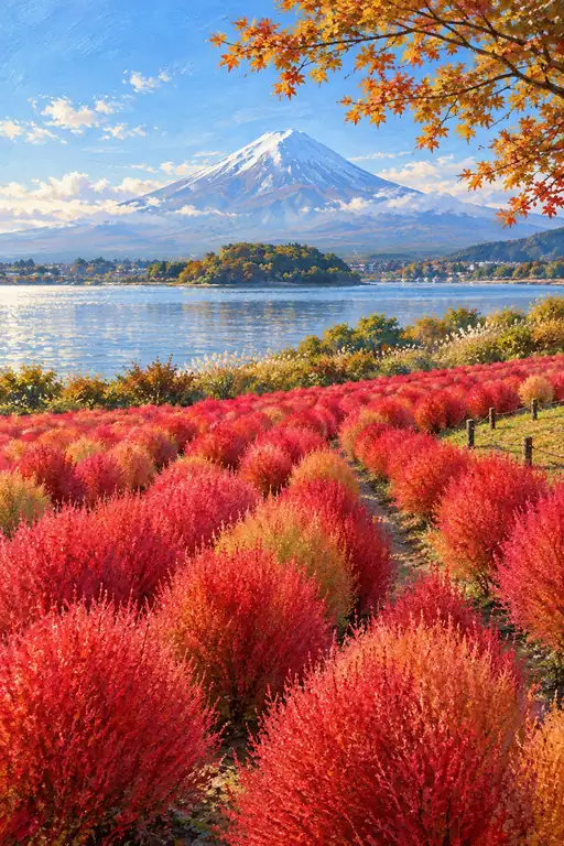 Scarlet Days Beneath Forever
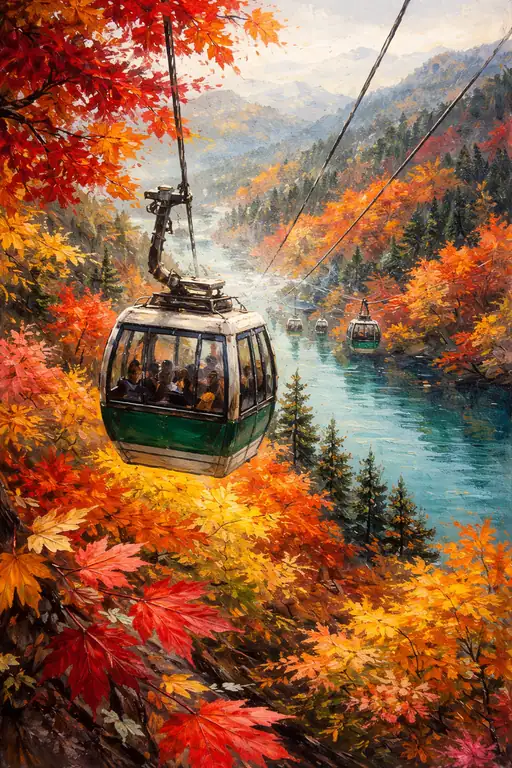 Suspended Over the Golden Sea
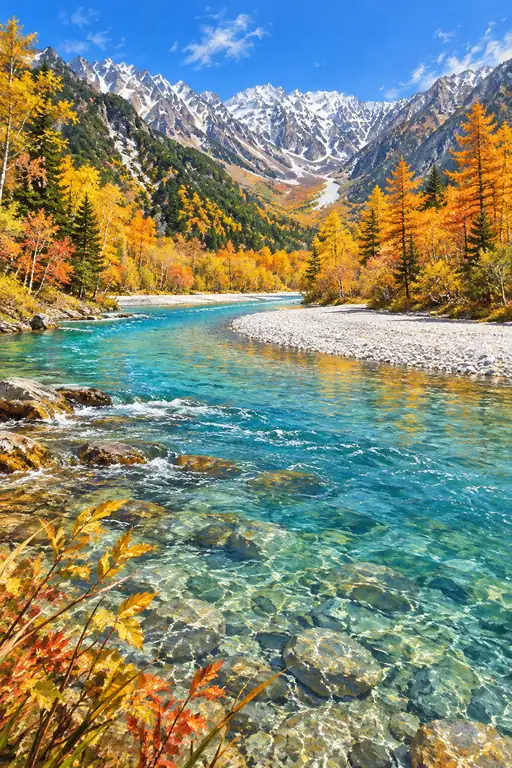 Autumn Carries the Mountains Home
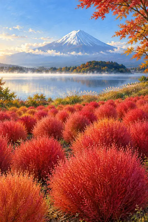 When Crimson Meets the Morning Mist
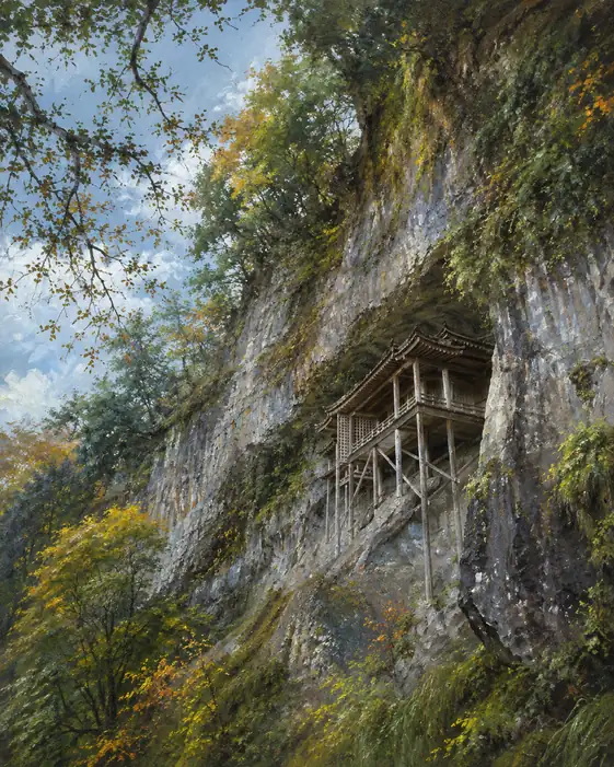 Discovery at the Edge of the Sky
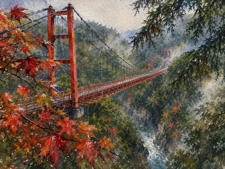 Echoes in Vermilion: A Bridge Through the Mist
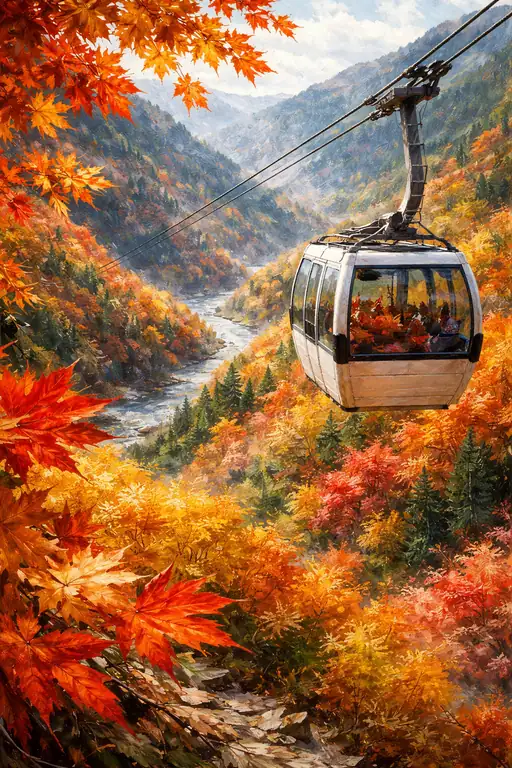 A Journey Through the Crimson Canopy
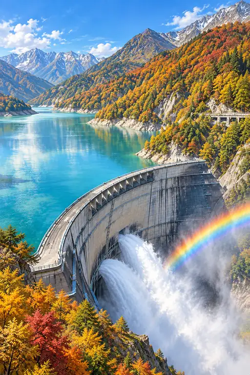 Beyond the Curve, a Sudden Rainbow
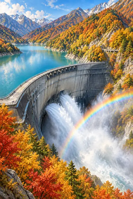 The Valley Answers in Color