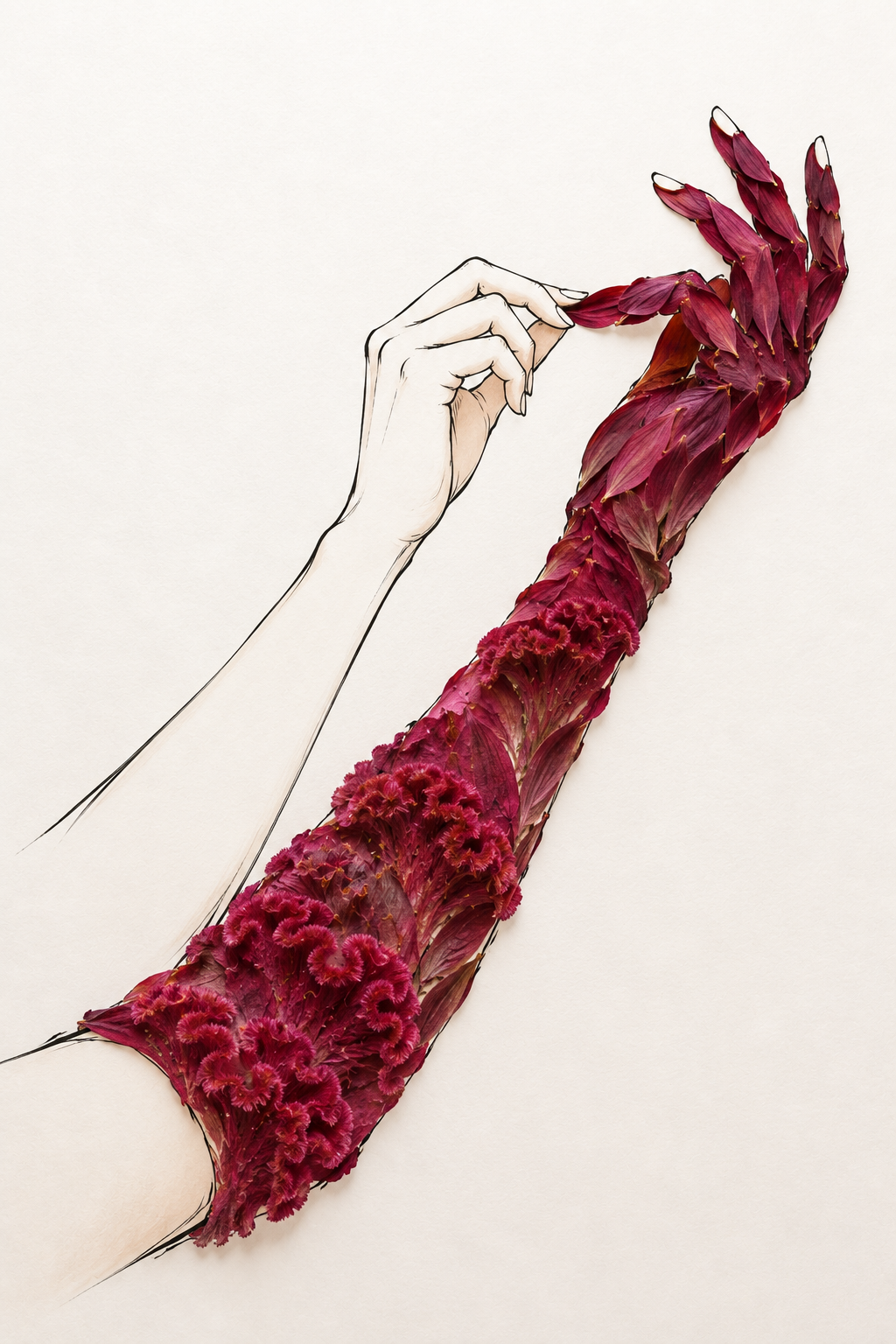
At Your Touch, the Crimson Answers
Critique
1. Introduction An extended arm reaches toward a second hand formed from deep crimson petals. The image places these two gestures in a broad, pale field, making the narrow space between their fingertips its dramatic center. 2. Description The pale human arm enters from the left and bends upward to a lightly curved hand. Its index finger touches or nearly touches a red petal projecting from the opposite form. That form rises diagonally from the lower left to the upper right. Clusters of ruffled dark flowers cover its lower portion, while overlapping pointed petals shape a palm and several raised fingers. 3. Analysis The two diagonals converge near the upper center, where the small fingertip contact interrupts the surrounding white space. Thin black contours and faint shading give the human hand a delicate outline. The floral hand gains weight from saturated color, dense overlapping surfaces, and uneven edges. This transition makes botanical texture serve a figurative structure. 4. Interpretation and Evaluation The near touch suggests recognition between unlike bodies. Yet the red form remains visibly floral, allowing the encounter to stay ambiguous rather than purely literal. The composition is effective because a minimal human gesture is set against an elaborate, tactile counterpart. The controlled crimson palette and the careful shift from clustered flowers to handlike petals show invention in both color and construction. 5. Conclusion At first the red shape seems simply an arm, but closer looking reveals its layered flower surfaces. The work's force comes from that double reading and from the tiny interval where the two fingers meet. Open space heightens the contact without adding a setting.
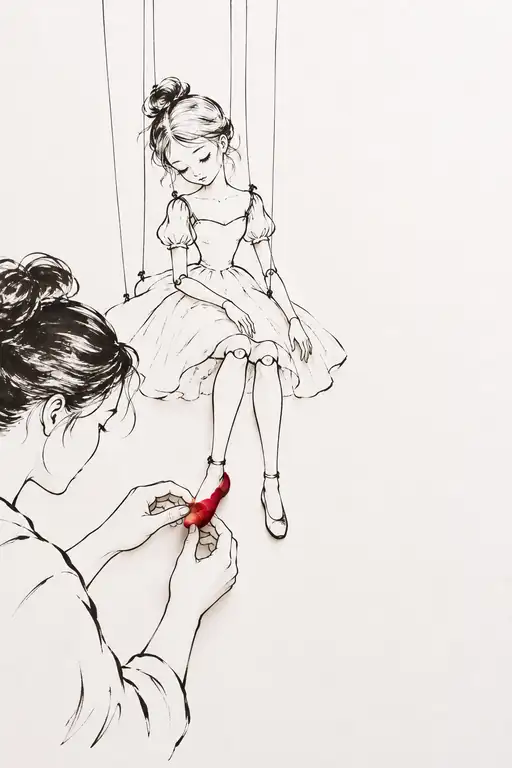 Someone to Steady My First Step
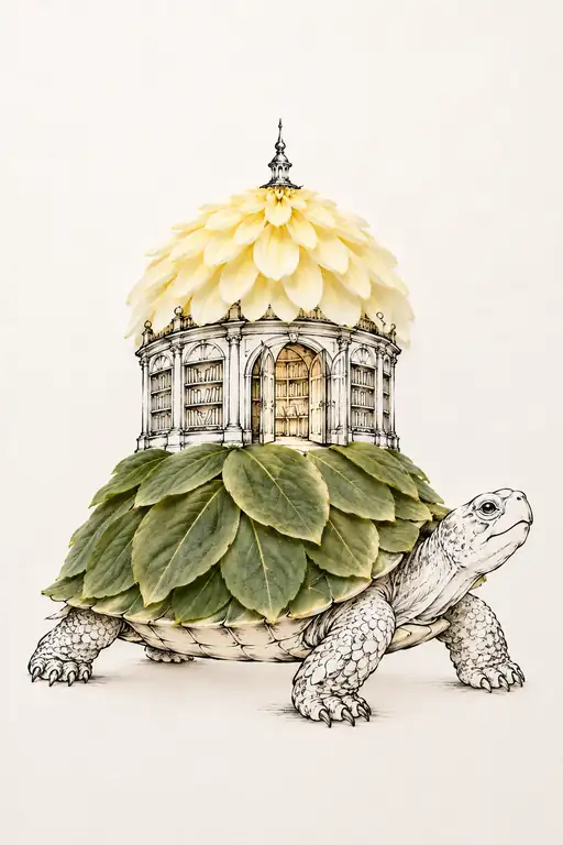 Every Story Travels at Its Own Pace
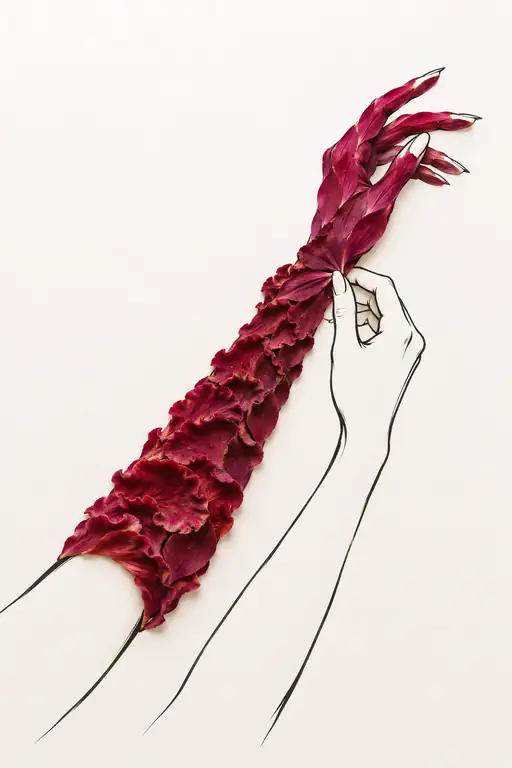 Gently, Where I Am Fragile
 What My Heart Hears
 Meet Me in the Quiet
 You Have My Trust
 Even Fire Needs to Sleep
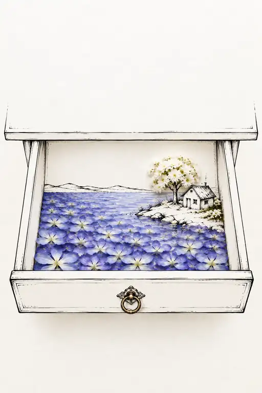 Open the Blue I Never Left
 Wrapped in a Crimson Refrain
 Keeping Violet Close
 Threshold of the Morning Sun
 The Geometry of Fleeting Hours