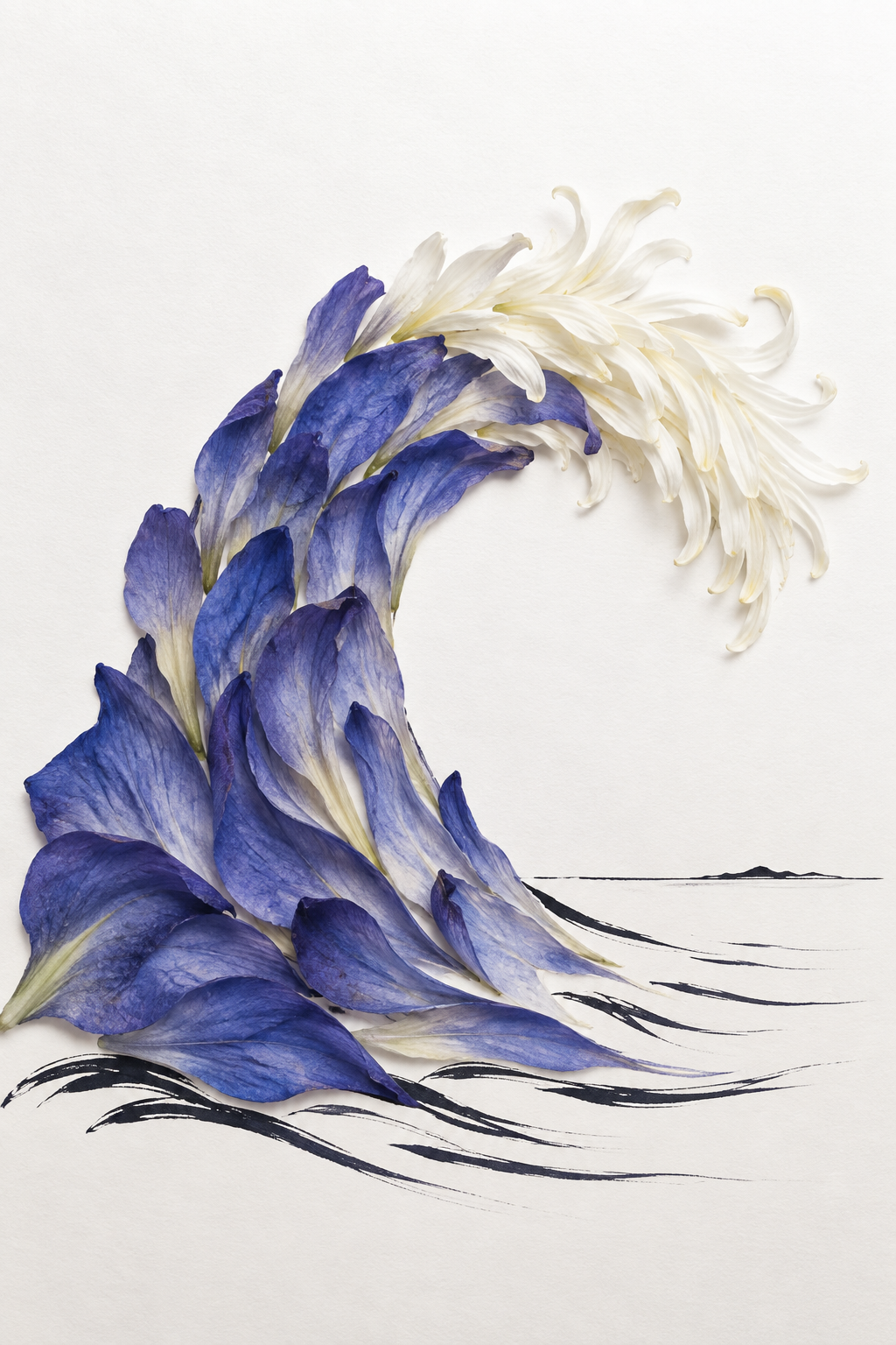
The Blue That Would Not Be Still
Critique
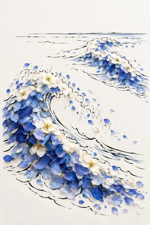
Introduction Blue and white petals form a curling wave against an almost blank paper ground. Black ink lines beneath them suggest a sea surface and a distant horizon. Description Broad blue-violet petals rise from the lower left and curve toward the upper right. Their pale bases overlap, while darker tips give the lower mass depth. At the crest, narrow white petals fan outward and curl at their ends. Sparse black strokes trail across the lower edge, and a thin horizon with small dark peaks stretches behind the wave. Analysis The great arc establishes the image's movement before individual petals become visible. Blue layers pack tightly at the base, then lighten and separate as they climb. The white tips extend that movement into fine, airy strands. Horizontal ink strokes under the wave counter its upward curve and locate it on a surface. Blue against white provides the strongest color contrast. Interpretation and Evaluation The floral wave holds two identities at once: a cluster of petals and a breaking crest. Its illusion depends on the direction of the overlapping blue pieces and on the white tips curling over the open center. The modest horizon and sparse water marks make the reading clear without enclosing the form in a fully drawn scene. Composition and color are disciplined, and the contrast between ink and layered petals gives the image a distinctive technique. Conclusion The first impression is of a wave in motion. Looking closer reveals how its energy is built from separate, fragile petals. The image turns that discovery into a reflection on how movement can be suggested by still forms.
Same Subcategory
 Crest of Emerald Thunder
Similar Artworks
 The Strength of a Gathering Blue
 The Blue That Will Not Rest
 The Blue Gathers Its Strength
 Blue Breaks into Song
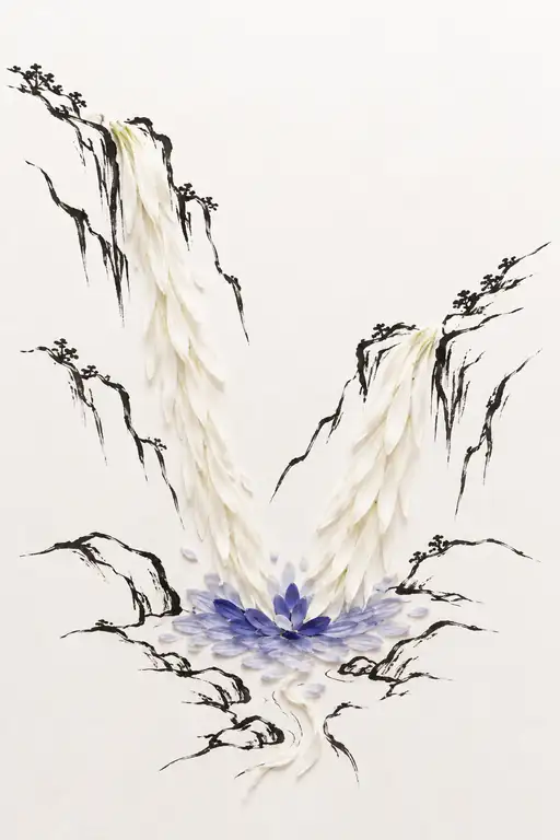 Where Two Silences Meet
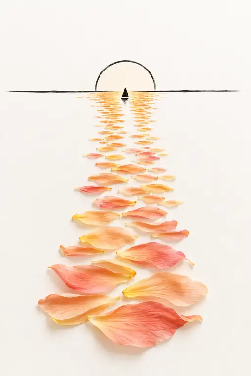 The Distance Glows with Promise
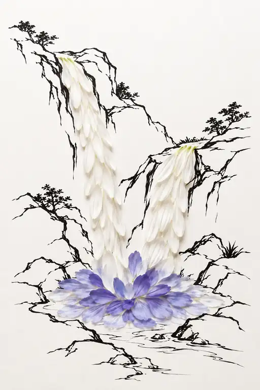 All Heights Return to Blue
 Evening Finds Its Way to Me
 Luminous Trail of White Petals to the Horizon
 Tides of Light and Floating Green