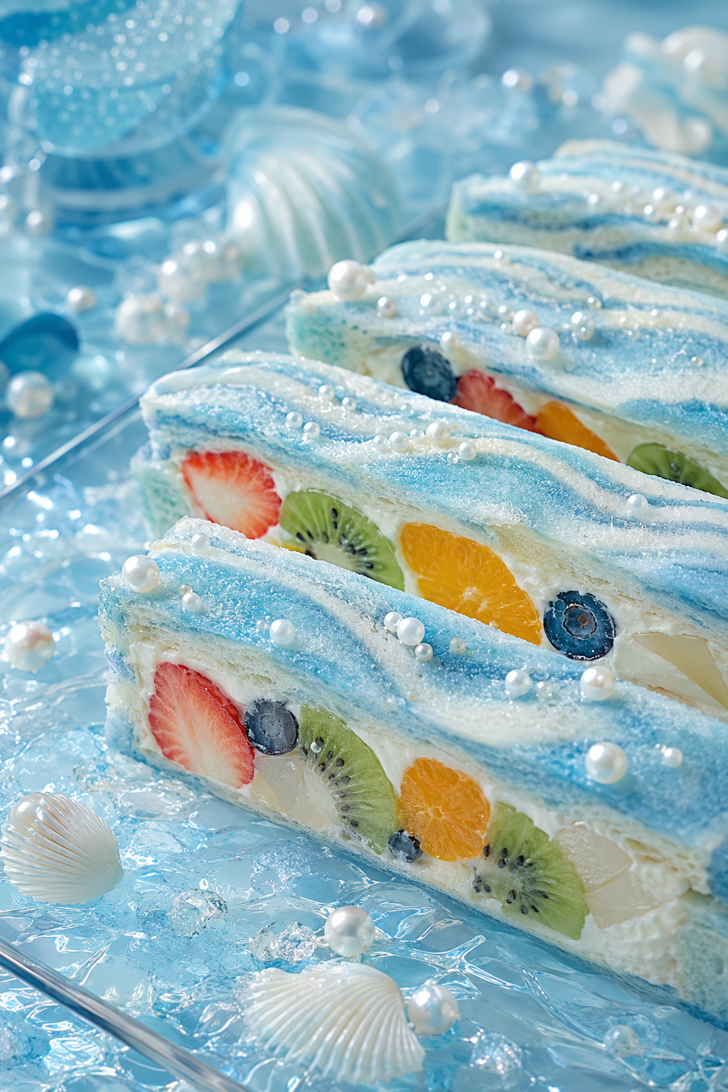
Pearls Along the Summer Shore
Critique
Introduction Blue-and-white fruit sandwiches resemble blocks of frozen sea, their cream displaying strawberry, kiwi, citrus, blueberry, and pale jelly. Familiar bakery food becomes marine fantasy without losing appetite or clarity. Description Three principal rectangular sandwiches recede diagonally from lower right to upper left, with another behind. Their pale blue bread carries darker wavy bands and a sparkling frosted surface. Thick white cream surrounds neatly cut fruits: red strawberry, green kiwi, orange citrus, dark blueberries, and translucent white pieces. Pearl-like beads rest on top. Clear blue crystals, white shell forms, glass vessels, and silver utensils fill the icy setting. Analysis Parallel sandwich edges establish a firm rhythm and recession. Wavy blue stripes soften that geometry and echo water. Fruit circles and half-circles punctuate the long cream bands with saturated complementary color. The nearest sandwich is sharpest and largest, while background objects dissolve into pale bokeh. Powdered bread, smooth cream, juicy fruit, hard pearls, and angular ice are carefully distinguished. High-key lighting suppresses heavy shadows but preserves depth through cyan variations and overlapping planes. Interpretation and Evaluation The sandwiches resemble geological strata, aquarium windows, or pieces of glacier containing preserved summer fruit. Shells and blue glass encourage the marine reading, while visible crumb and cream maintain edibility. Repetition conveys abundance, yet changes in fruit order prevent mechanical sameness. The pearl decorations could feel excessive, but their varied sizes extend the bubbles-and-sea motif coherently. Conclusion Graphic order meets sensory freshness. Cool surroundings heighten warm fruit, and the diagonal sequence invites comparison of each cross-section. Monochrome atmosphere and vivid ingredients balance confidently. The result is playful and luminous.
Same Subcategory
 Open the Moon, and Find a Rabbit’s Dream
 The Sunflower Pudding That Grows Stars
Similar Artworks
 A Small Star for the Snow Bear
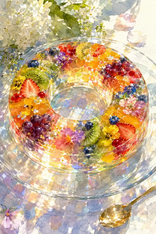 Summer Makes a Wreath of Light
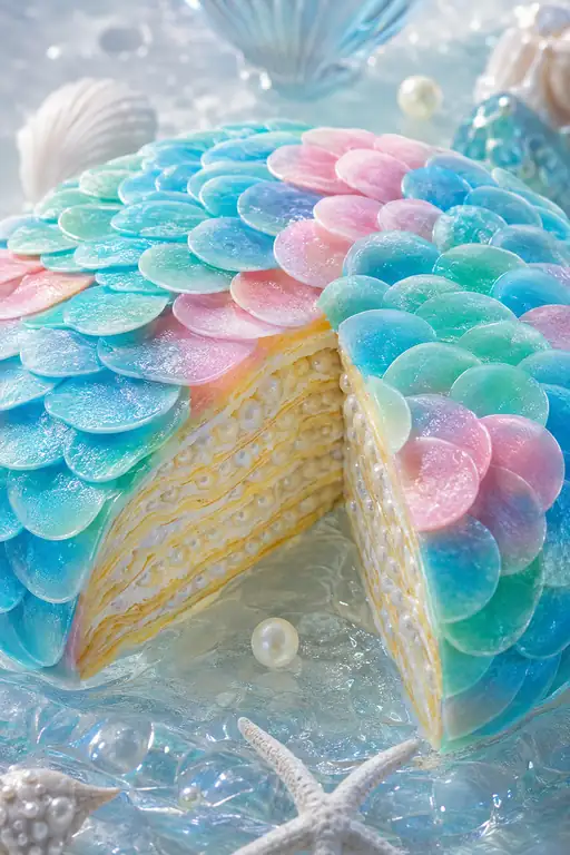 The Sea Wove a Dress of Pearls
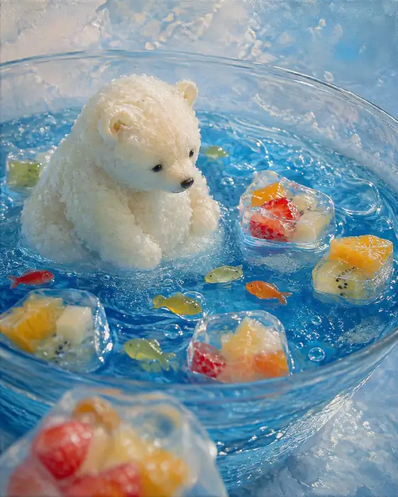 Polar Bear Counts the Floating Summer
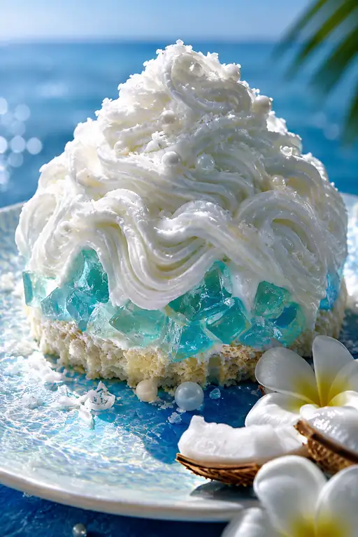 White Waves Climb a Coconut Mountain
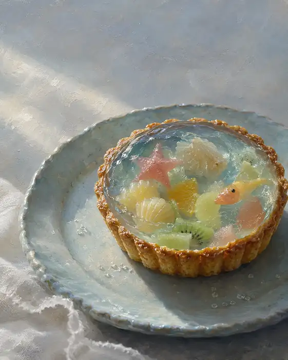 A Tiny Tide Pool Holds an Entire Summer Sea
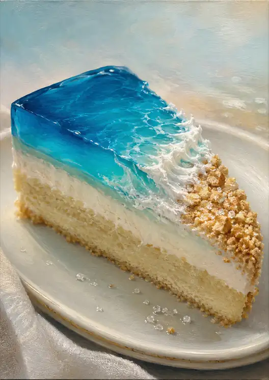 A Wave Left on the Plate
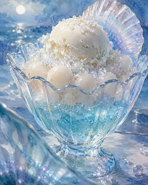 Pearl Tide in a Shell
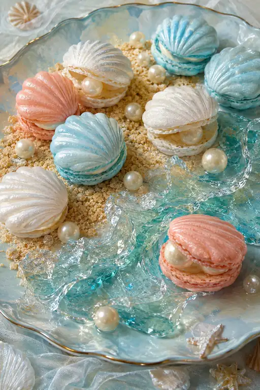 Summer Whispers in a Pastel Shell
 Gentle Harbor of Persimmon Amber