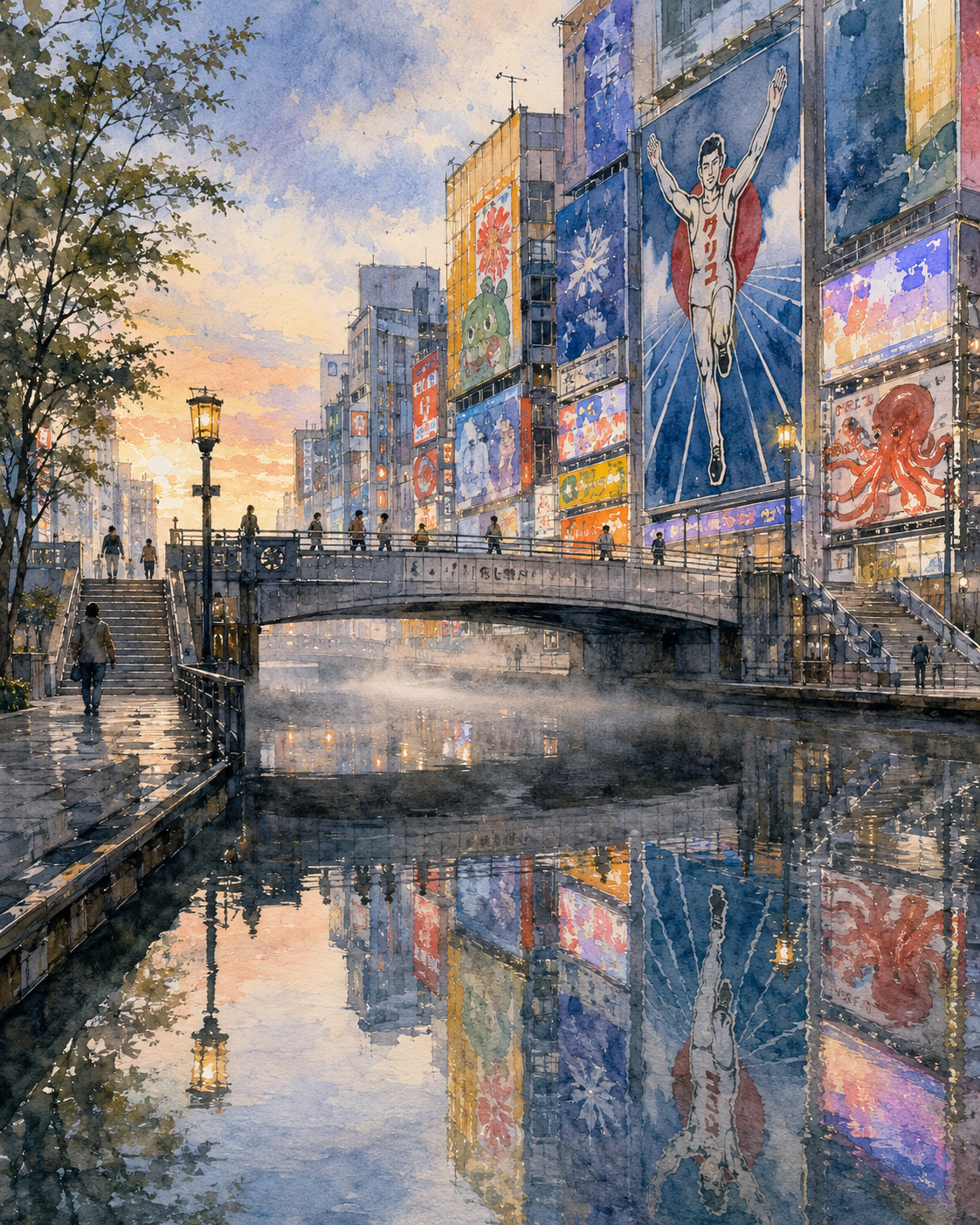
The River Borrowed the City's Dreams
Critique
Introduction This work presents Ebisu Bridge at Dotonbori through a transparent watercolor. It begins with a recognizable place, yet organizes light and color so that the subject reads immediately. The initial scenic appeal gradually gives way to an appreciation of the painted surface and its controlled structure. Description Ebisu Bridge crosses the middle distance as giant signs and buildings reflect in the river. Calm foreground water elongates advertising colors. Foreground, middle distance, and background remain clearly legible, carrying the eye steadily into space. The palette centers on pale blue, vermilion, orange, and gray, and its shifts of temperature describe both time of day and atmosphere. Analysis The composition gives the principal motif a firm position while using surrounding forms as frames and directional lines. Small sign colors contrast with transparent water, organizing urban density without confusion. Warm and cool passages separate spatial layers, and the brightest accents establish a readable focus without flattening the quieter areas. Interpretation and Evaluation The scene functions as more than a record of a celebrated view; it becomes a meeting point between natural time and attentive observation. Its convincing description, balanced composition, disciplined color, and responsive technique demonstrate control. Originality lies less in distorting the place than in intensifying its light while preserving recognizable geography and architecture. Conclusion The work successfully joins accessible landscape imagery with sustained attention to material and design. Description, color, composition, and technique reinforce one another rather than competing for notice. What first appears primarily picturesque becomes, through longer viewing, a carefully ordered meditation on atmosphere, distance, and the act of looking.
Same Subcategory
 Lights Linking Two Seas
Similar Artworks
 A Quiet Observer in the Neon Sea
 Rain Carries the City Lights Home
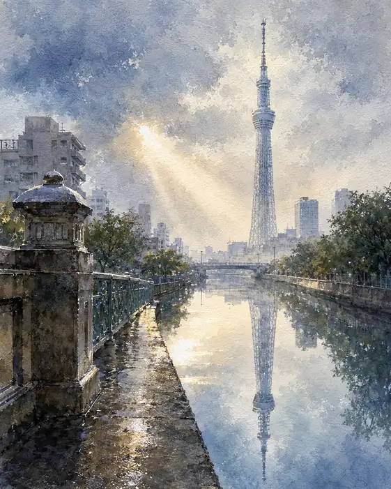 The River Looks Up at the Sky Twice
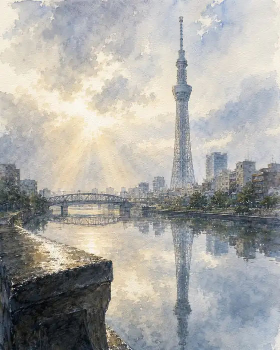 The Tower of Light Sleeps in Water
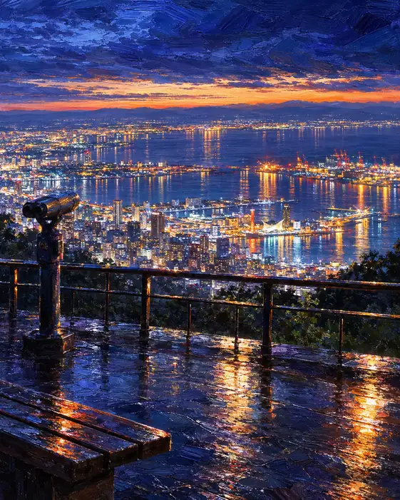 The Bay Spills Its Stars
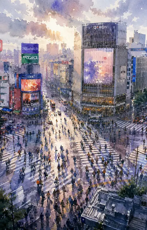 The Crossing Unravels into Light
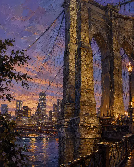 Symphony of Stone and Light
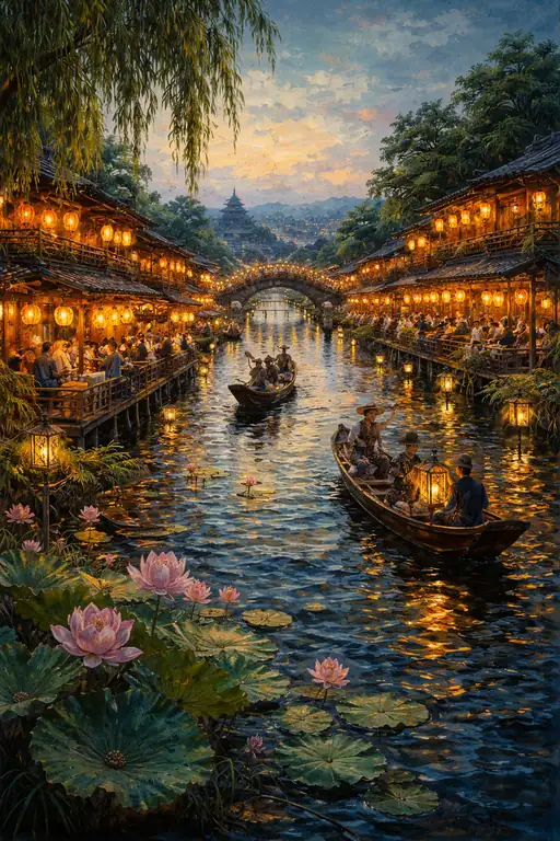 Reflections of the Silent Ryokan
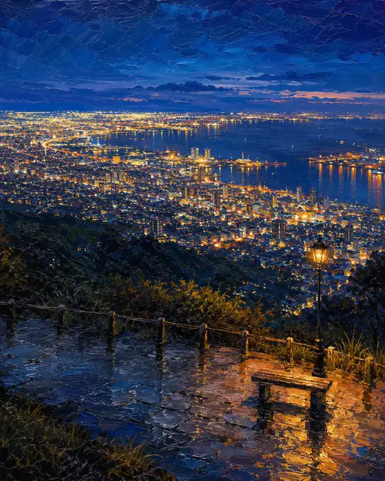 A Million Windows Beneath One Lamp
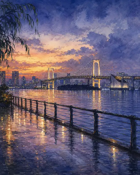 The Rainlit Path to the Bridge