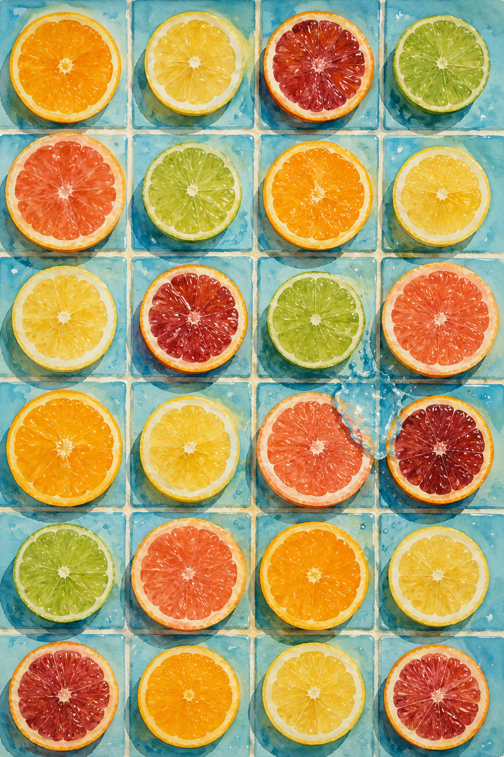
Symphony of Blue and Citrus
Critique
1. Introduction This watercolor painting presents citrus slices arranged in a grid on light blue tiles, with a splash of water adding movement. The contrast between the bright fruit colors and the cool tiles evokes a refreshing sense of energy. This essay discusses the color relationships and the balance between order and motion in this graphical still life. 2. Description The composition is structured by a grid of six rows and four columns of square blue tiles. A citrus slice, including orange, lemon, lime, and grapefruit, is centered on each tile. On the right, a clear splash of water with scattering droplets and a circular ripple disrupts the geometric pattern of the tiles. 3. Analysis The color palette relies on the contrast between the cool blue tiles and the warm oranges, yellows, and reds of the fruit slices. Delicate watercolor gradients and fine brushwork capture the translucent pulp and fibrous texture of the rinds. The asymmetrical splash of water introduces a dynamic tension to the grid. 4. Interpretation and Evaluation The work symbolizes the harmony between artificial order, represented by the grid, and natural energy, represented by the fresh fruit and water. Rendering the transparent liquid and water droplets using paper reserve and light washes shows high technical skill. The fusion of graphic design and realistic watercolor makes it a visually successful piece. 5. Conclusion Initially seen as a simple pattern of fruit, closer observation shifts the viewer's focus to the texture of the pulp and the realism of the splash. The tiled surface serves as a backdrop highlighting the freshness of nature. In conclusion, this painting achieves high aesthetic quality, demonstrating a masterly balance of watercolor techniques.
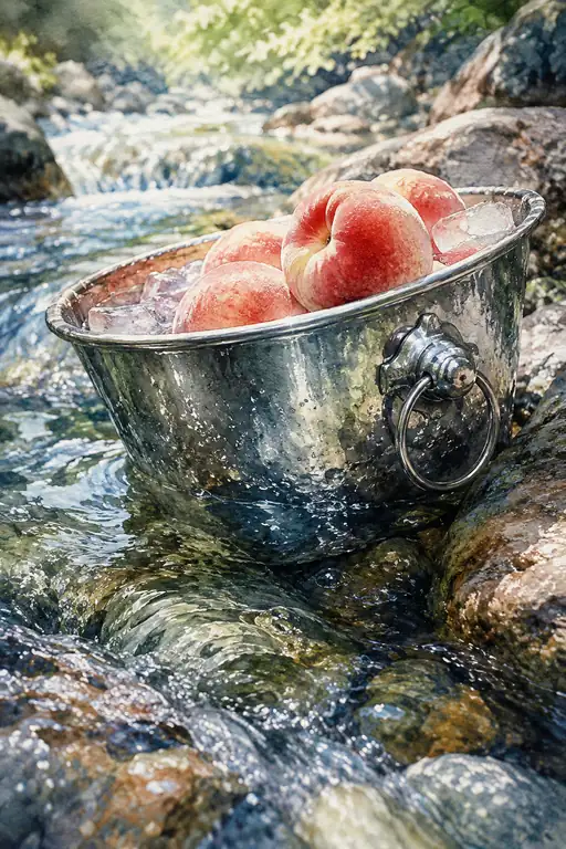 Chilling Summer in the Flow
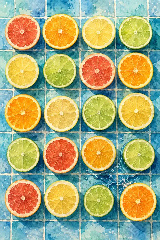 Midnight Citrus Splash
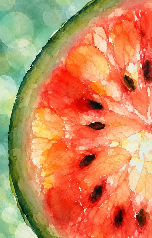 Summer's Crimson Beat
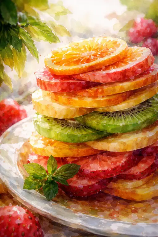 Vibrant Citrus Tower
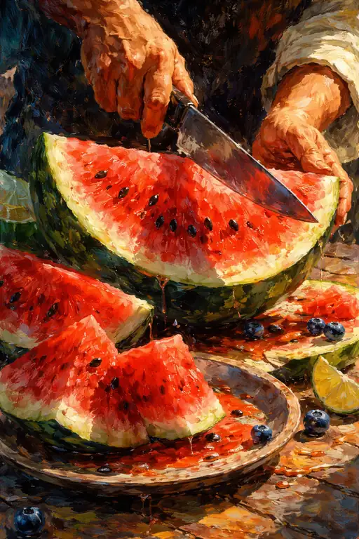 Vibrant Burst of a Summer's Heart
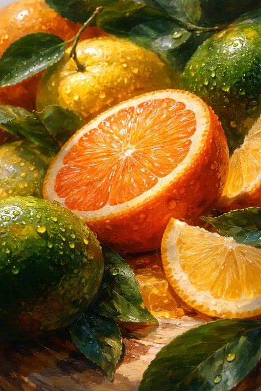 Bursting with Morning Light
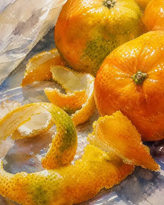 Life’s Spiraling Radiance
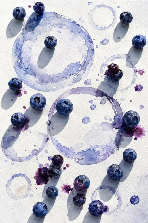 A Symphony of Crushed Indigo
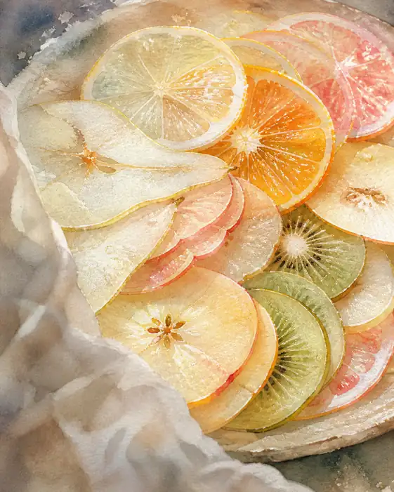 Light Dancing Through the Harvest
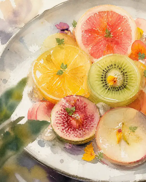 The Soul of Summer’s Fruit
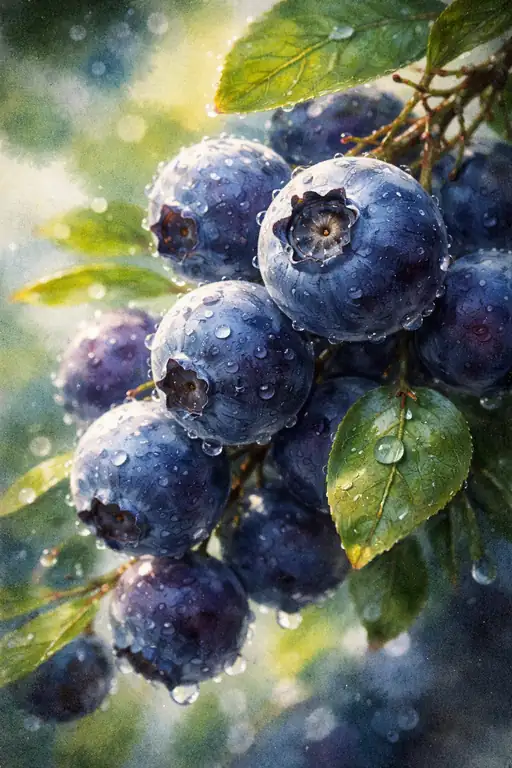 Pearls of the Morning Mist