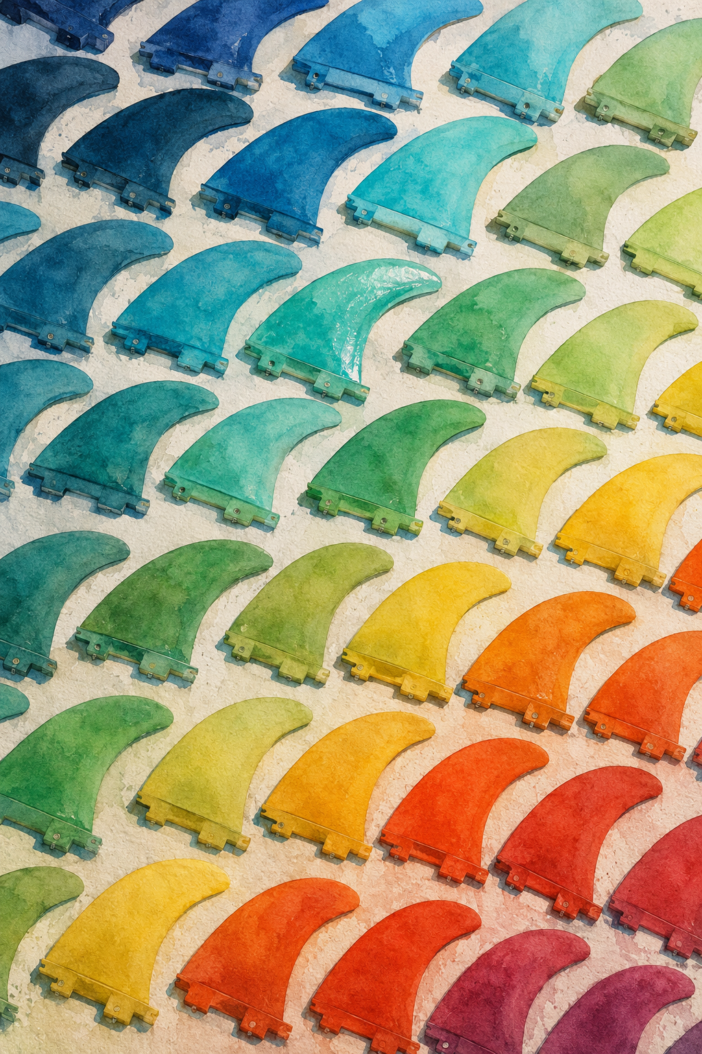
Rainbow Rhythms on the Summer Sand
Critique
1. Introduction This watercolor painting presents a highly stylized design featuring multiple surfboard fins arranged in a neat grid. It showcases a vibrant rainbow gradient that creates a musical rhythm across the canvas. This critique analyzes the composition's geometry, color spectrum, and the decorative appeal of the work. 2. Description The canvas is filled with single surfboard fins aligned in parallel rows. The fins display a smooth color transition from dark blue at the top-left to green, yellow, red, and purple at the bottom-right. Each fin is rendered with detailed mounting bases on a textured, off-white sandy background. 3. Analysis The color palette utilizes a full spectrum of hues, generating a dynamic visual flow through continuous transition. Subtle watercolor washes provide gentle tonality within each fin, preventing the flat appearance of graphic design. The diagonal alignment establishes a strong sense of direction and structural stability. 4. Interpretation and Evaluation The work transforms functional surf gear into an aesthetic pattern, reflecting a pop-art influence and seaside culture. The rainbow colors symbolize the brightness of summer, while the neat arrangement suggests peace and harmony. The precise rendering of the curved fins displays excellent watercolor control and creative vision. 5. Conclusion In conclusion, the painting successfully achieves a balance between strict geometry and playful colors. The initial impact of the graphic layout deepens into an appreciation of the organic watercolor textures. The harmonious design leaves a lasting impression of freshness and refined decorative art.
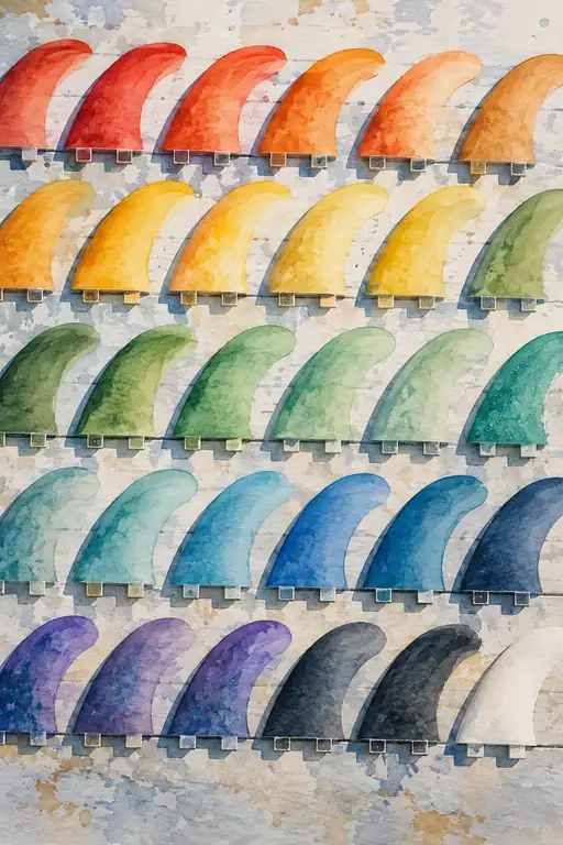 Specimens of the Tide
 Traces of a Rainbow Summer
 Traces of Summer Joy
 Resting Colors of the Arena
 The Lens That Loved the Light
 The Silent Breath of Morning Light
 Echoes of a Vibrant Thirst
 Prismatic Harmony
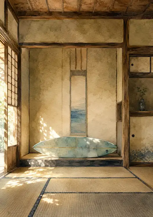 The Ocean Brought Inside
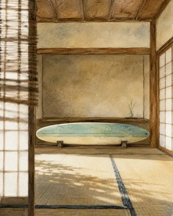 Waiting for the Wave