
The Quiet Order of Summer Days
Critique
1. Introduction This watercolor painting depicts a colorful shoreline lined with beach huts and parasols from a top-down aerial perspective. The contrast between geometric man-made order and organic waves creates a pleasant visual rhythm, demonstrating a highly successful fusion of graphic design and painterly expression. 2. Description On the left side, a turquoise sea sends white, foamy waves onto the beige sand. On the right, wooden huts painted in red, yellow, and blue are arranged in neat rows of four, accompanied by matching striped umbrellas casting soft shadows on the sand. 3. Analysis The color palette contrasts primary red, yellow, and blue against the natural background tones of sea and sand, reinforcing a flat, graphic aesthetic. Technically, sharp wet-on-dry watercolor strokes define the geometric structures, while soft washes capture the fluid, moving foam of the waves. 4. Interpretation and Evaluation The artwork presents an idealized seaside resort where human order and natural beauty coexist harmoniously. The symmetry of the cabins against the changing waves symbolizes a balance between society and nature. The creator's command over composition and water textures deserves a high critical evaluation. 5. Conclusion This piece successfully transforms a summer beach into a geometric pattern through its aerial view and vivid colors. Viewers are charmed by the neat, colorful huts before noticing the waves' details. Ultimately, the balance between systemic order and painterly expression defines the work's core value.
Same Subcategory
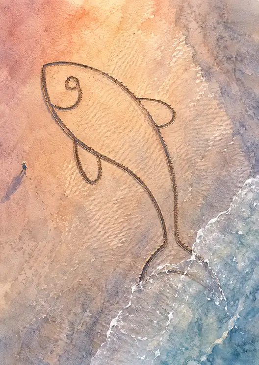 Footsteps Along the Fleeting Giant
Similar Artworks
 The Quiet Parade of Summer
 Symphony of Sand and Steel
 Footprints Left on the Summer Shore
 Sigh of the Sea
 A Moment of Seaside Solitude
 Solitude along the Blue Divide
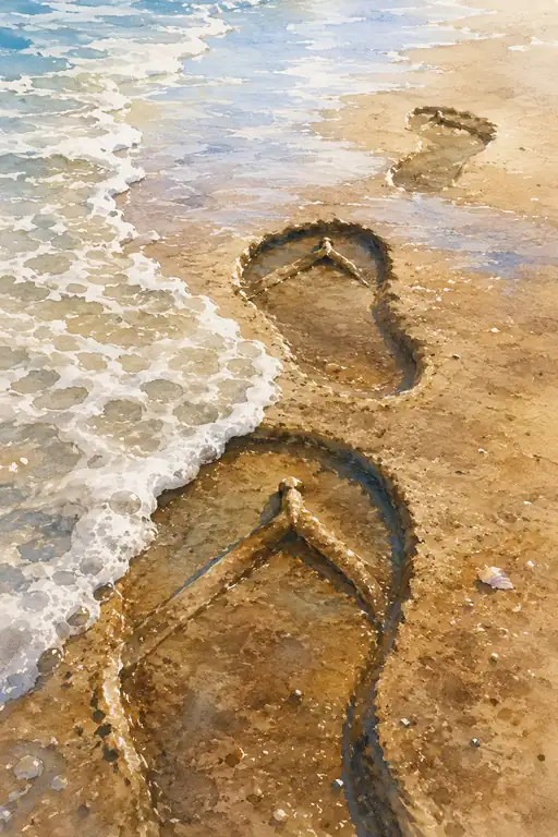 Memories Carried Away by the Waves
 A Solitary Blue in the Endless White
 Under the Crimson Shade
 Summer's Lasting Glow: A Shoreline Dream