The Color of Wind
Critique
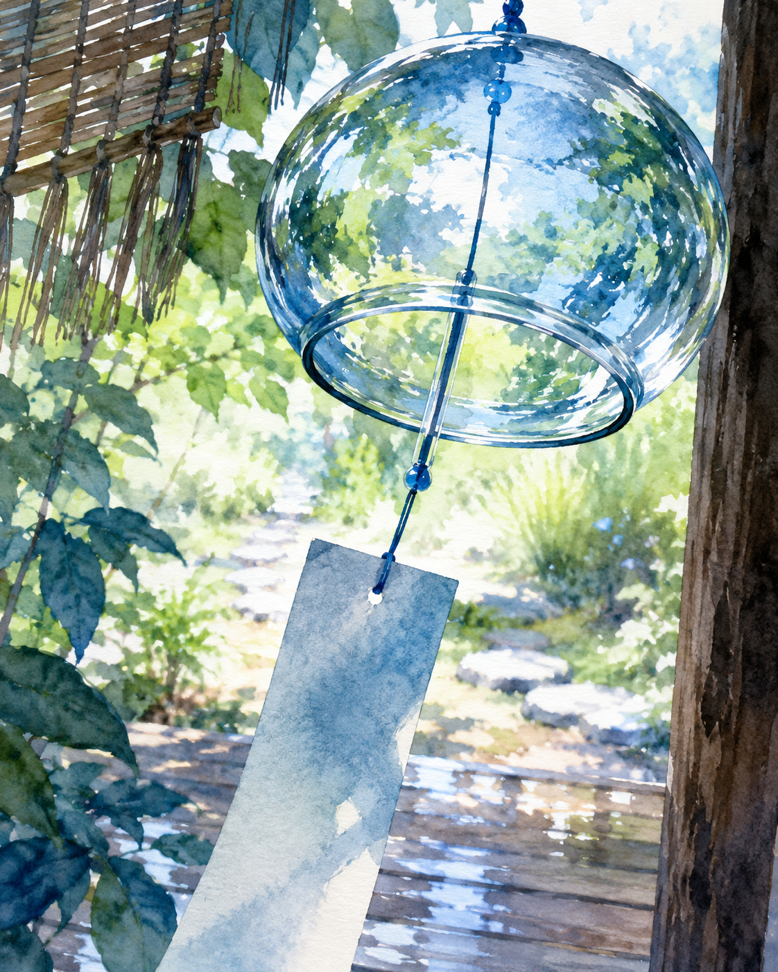
1. Introduction This beautiful watercolor painting captures a glass wind chime, a traditional symbol of Japanese summer, showcasing remarkable transparency. Hanging under the eaves, the chime sways gently, masterfully evoking a sense of cool tranquility and quietness. It functions as an excellent educational artwork that elevates an everyday moment into poetic beauty. 2. Description On the right foreground stands a weathered wooden post, from which a bluish-glass wind chime is suspended. A paper strip displaying soft blue watercolor gradients hangs below, tilting slightly to the left in the breeze. Green leaves border the top left next to a reed screen, while garden stepping stones recede into the bright background. 3. Analysis The characteristic layers and bleeding of watercolors effectively depict the delicate texture of the glass and its reflections of light. Highlights on the sphere define its three-dimensional roundness and hardness. Blurring the background garden draws focus to the chime, creating a shallow depth of field. The blue and green palette enhances visual coolness. 4. Interpretation and Evaluation This artwork translates invisible phenomena, such as the wind and the sound of the chime, into visual imagery. The swaying paper strip and light filtering through the scene create a sense of flowing time and atmospheric movement. The contrast between the detailed glass and the blurry, bleeding background is highly commendable. 5. Conclusion Initially appearing as a simple summer landscape, deeper viewing reveals subtle shifts in light and breeze. The translucent watercolors and balanced negative space bring quietude and comfort to the viewer's mind. Ultimately, the silent painting becomes an immersive experience, evoking the cool, nostalgic sound of summer.
Same Subcategory
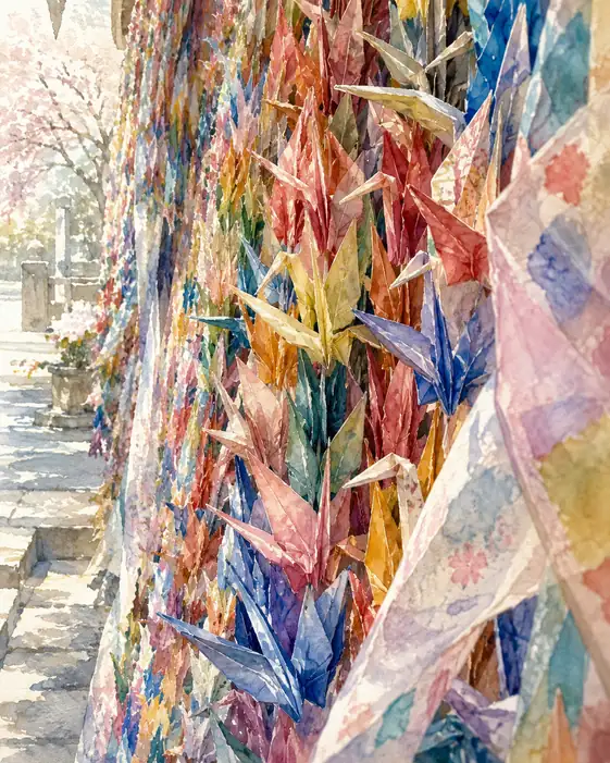 A Thousand Fluttering Prayers
Similar Artworks
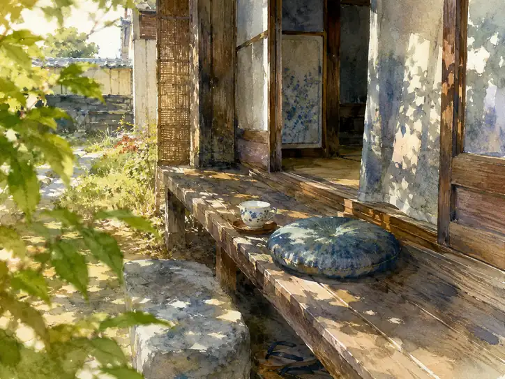
 Breeze of Nostalgia
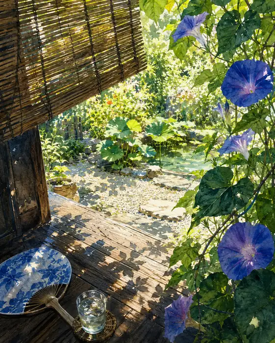
 Whispers of the Wind
 Whispering Sunbeams on the Veranda
 The Song of a Summer Breeze
 Whispers of the Light-Dappled Path
 The Green Whisper of the Veranda
 Rainy Season's Tranquil Gateway
 Where the Cool Breeze Lingers
 Memory of the Sun-Drenched Leaves
 Reflections of Tranquility: Sunlight on the Wet Engawa