Beacon in the Wind
Critique
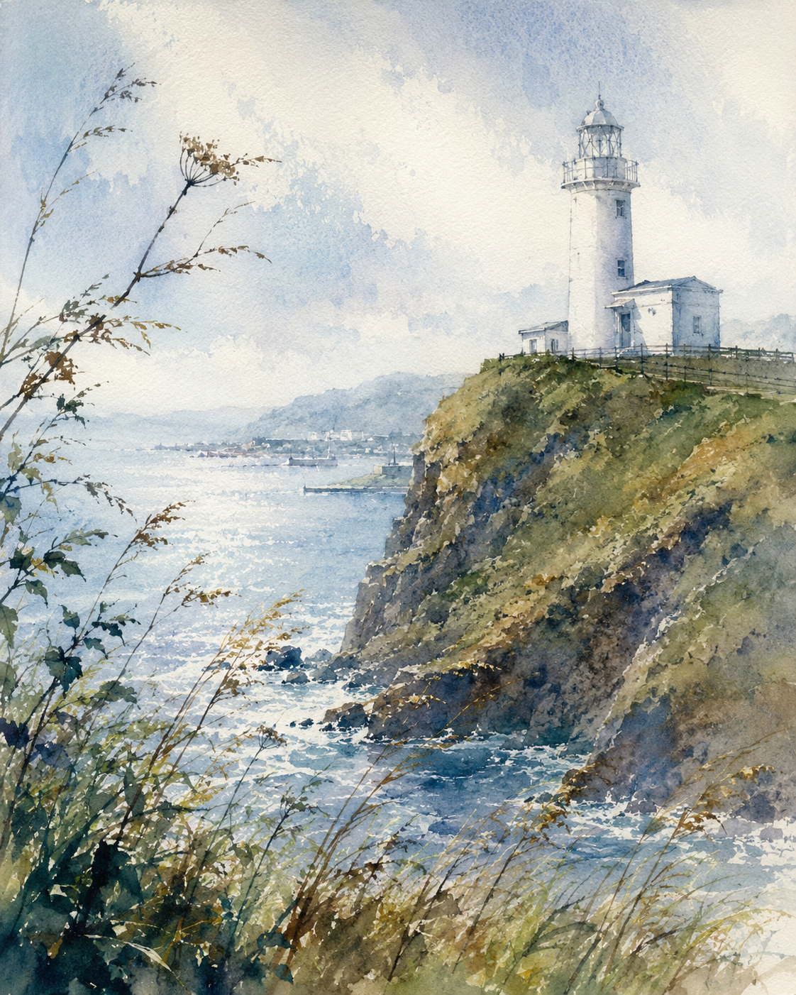
1. Introduction This work is a coastal landscape centered on a lighthouse rising above a steep headland. Sea, cliff, and sky are arranged in a calm vertical format that balances exposure and shelter. 2. Description In the foreground, tall grasses and thin stems lean across the left edge and lower margin. Beyond them, sunlight spreads across pale water, while a white lighthouse and attached buildings stand on a grassy cliff to the right. Faint hills and a small harbor settle into the distance under a washed blue sky. 3. Analysis The composition relies on a contrast between the open bay and the dense slope. Loose watercolor passages in the sky and sea are set against sharper accents on railings, masonry, and rock faces, giving the scene both softness and structure. Cool blues are moderated by olive and ocher notes, so the light feels airy rather than dramatic. 4. Interpretation and Evaluation The image can be read as a study of guidance within a broad natural setting. The tower is prominent, yet it does not dominate the whole view; instead, it works with the cliff, shoreline, and atmosphere to organize the eye. The work is convincing in its spatial design, in the fresh handling of color, and in the technique that suggests wind, glare, and stone with economy. 5. Conclusion At first, the lighthouse seems to be the sole focus. Closer viewing shows that the surrounding grasses, water, and distant coast are equally important to the painting's order. The impression shifts from a simple landmark scene to a more complete meditation on light, distance, and orientation.
Same Subcategory
Similar Artworks
 Guardian of the Cerulean Horizon
 Sentinel of the Azure Breeze
 Whispers of Spring on the Windswept Cliff
 The Silent Beacon of the Sea's Serenade
 Silent Sentinel of the Turquoise Cove
 A Beacon against the Roaring Tide
 The Beacon’s Solitary Path
 Sentinel of the Shore: Echoes of Memory
 Guardian of the Blue Horizon
 A Song of the Clear Blue